Injest
The Challenge.
Injest came to us as a cannabis company. Their real IP wasn't the cannabis — it was the straw itself. A proprietary compostable delivery infrastructure that can be lined with any compound and dropped into any beverage. The design challenge: help the client understand what they actually were, then build a brand system that could grow with them.
The Insight.
They weren't a cannabis company. They were a delivery system platform that launched with cannabis first. Every design decision — identity, packaging, digital — was built to signal scalability, not category specificity.
The Result.
Complete brand system across identity, packaging, print, and digital — built to migrate from cannabis into hydration and energy without a rebrand. Following a second funding round, that expansion is now underway.


The Strategy.
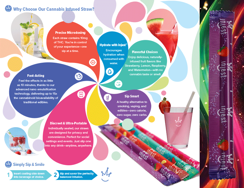
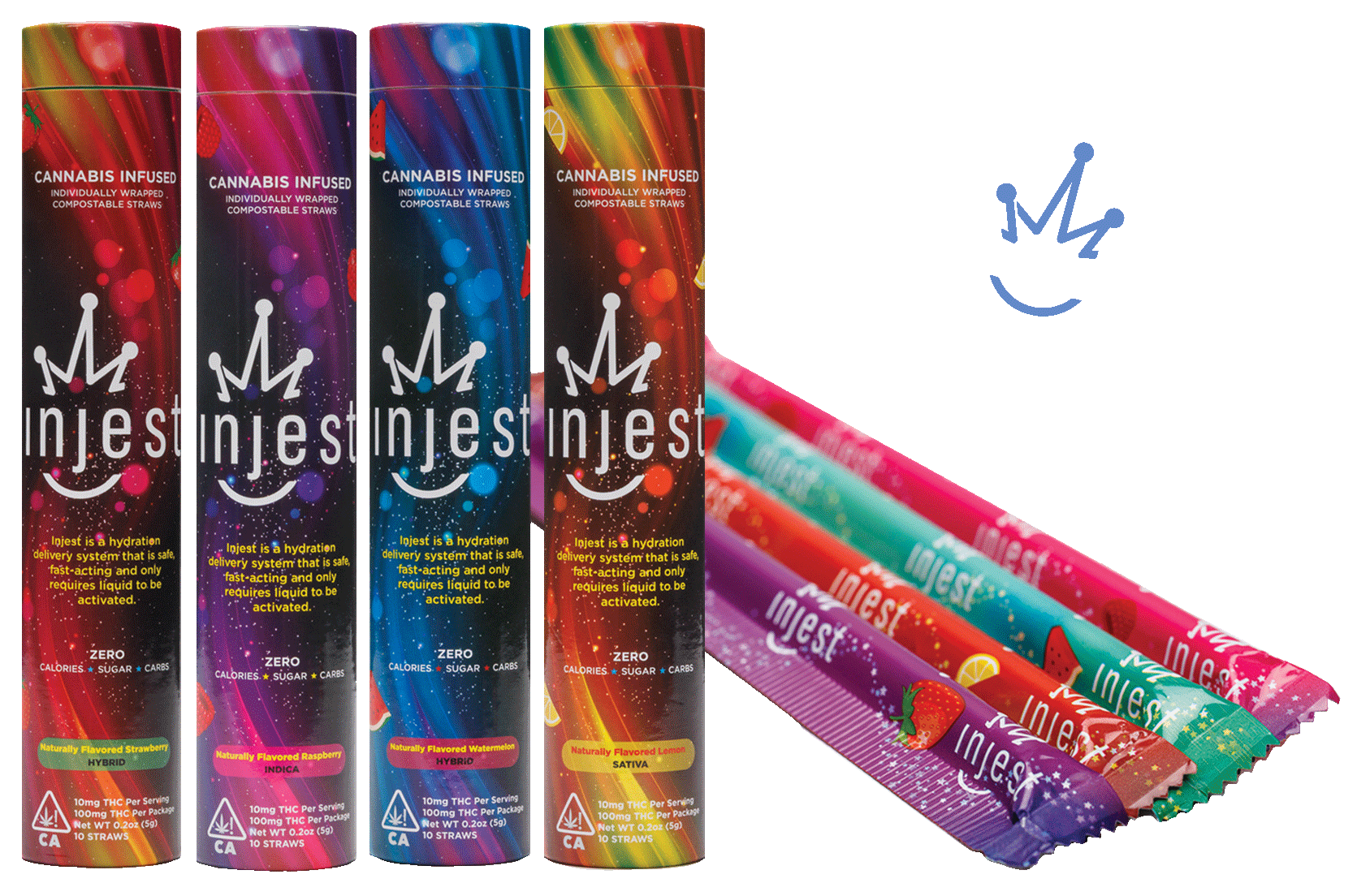
The 4-SKU packaging system required each flavor to feel distinct while belonging to the same world. The visual environment — a swirling cosmic field of color and movement — was developed using generative AI. A found color direction became the starting point, fed into AI to explore movement and energy at scale. Dozens of directions were art directed down to the final environment, then refined in Illustrator to meet print production specifications. Each SKU shares the same cosmic foundation while carrying its own color signature — Strawberry, Lemon, Raspberry, Watermelon — ensuring shelf cohesion and individual product recognition simultaneously. The consumer brochure used an organic petal and bubble infographic system to explain the six core benefits in a visual language that felt approachable and premium without relying on clinical or cannabis-specific iconography.